Payment Form Templates
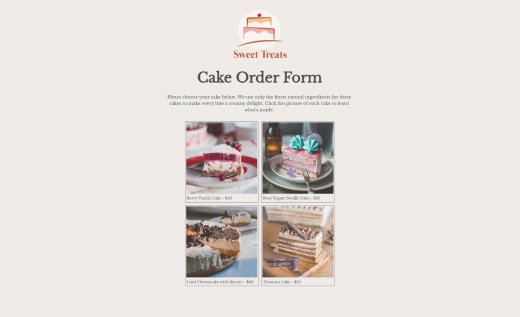
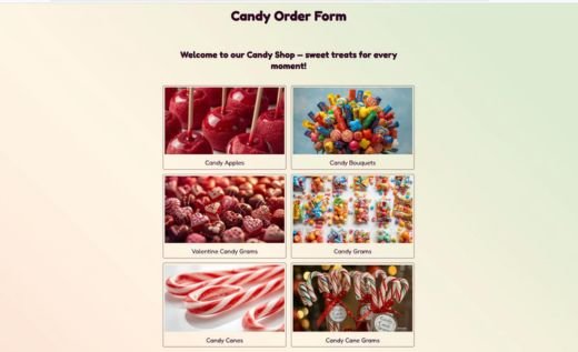
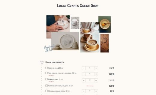
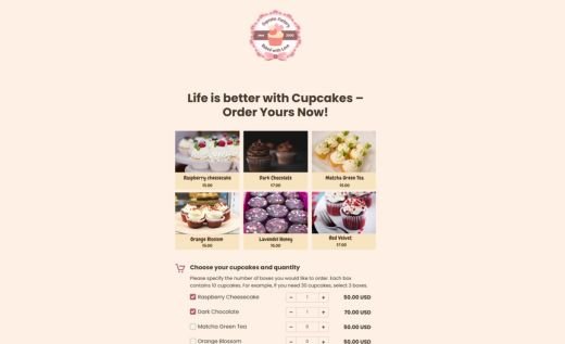
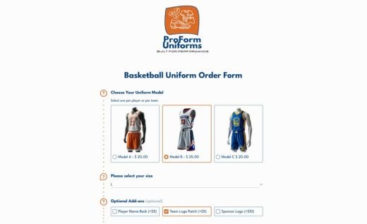
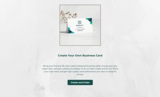
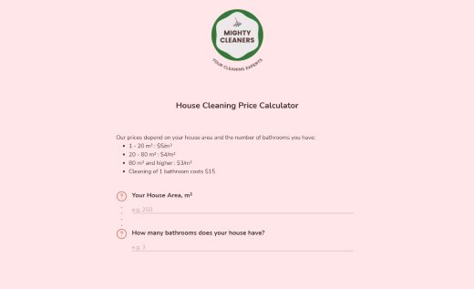
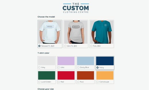
Running a business online? You’re in the right place! With AidaForm, you can accept orders and payments using a single payment page that’s quick to set up and easy to use. Pick a pre-made template and customize your payment form in minutes — no HTML required! Whether you’re collecting donations, selling items, managing memberships, or promoting events, AidaForm offers flexible fields and adjustable payment amounts.
Need something simple? Start with a free online form that includes the Order Cart field to gather orders without upfront payment. For full automation, upgrade to an Expert account and use our form examples with PayPal or Stripe to accept secure online payments instantly!Free Plan Order Forms
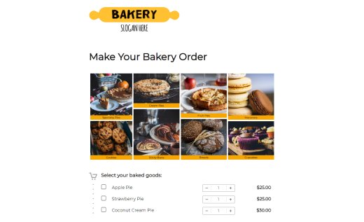
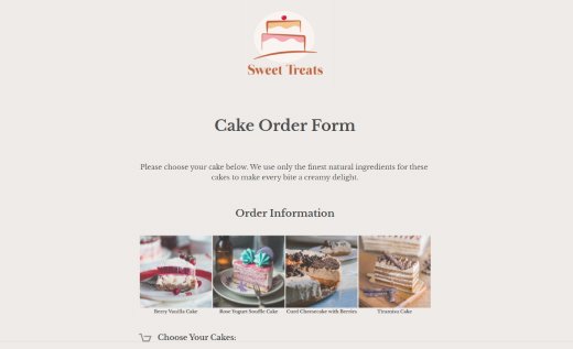
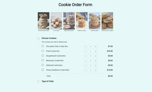
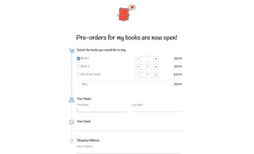
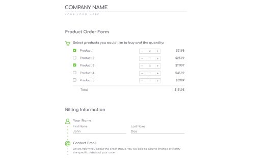
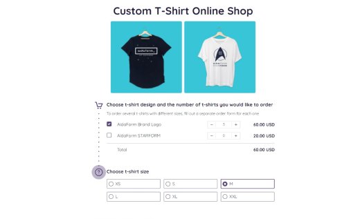
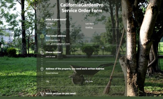
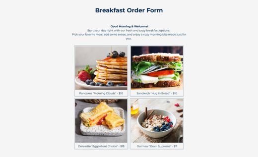
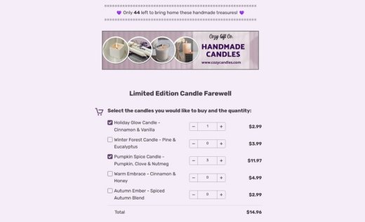
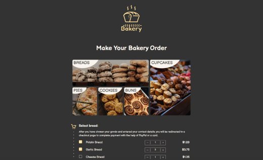
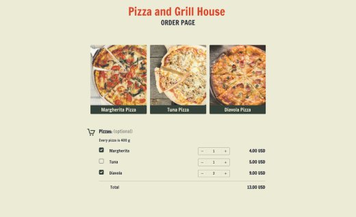
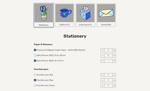
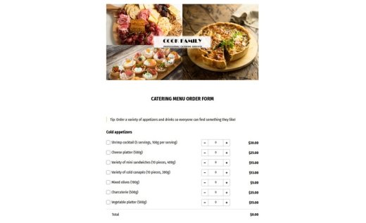
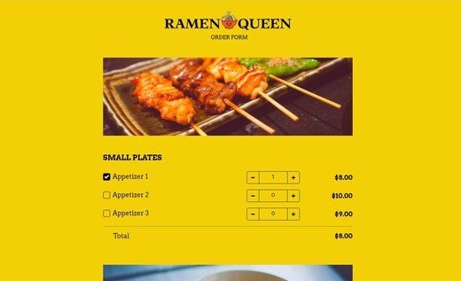
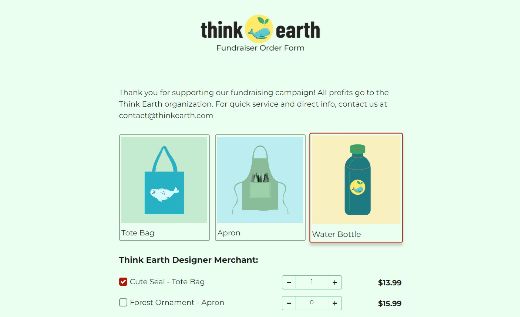
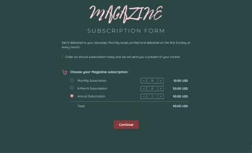
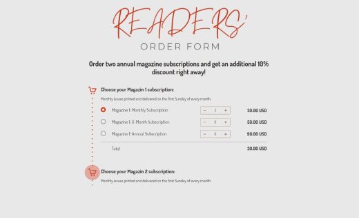
Simple order forms with one or more Order Carts. Each cart shows its own total, but multiple carts don’t add up automatically. Payments aren’t collected online — you just review the order, calculate the final sum if needed, and send an invoice manually.
Forms with a PayPal field
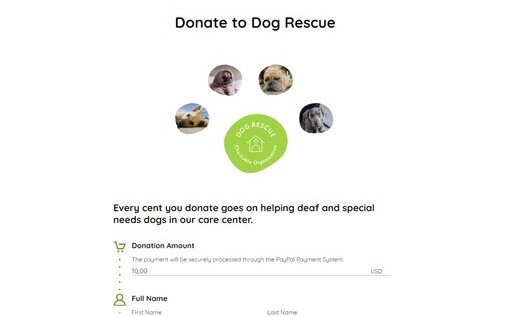
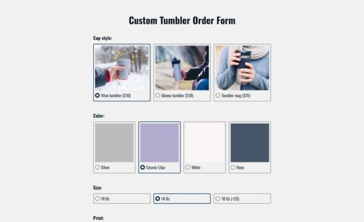
Forms with a secure PayPal field connected straight to your account. Set a fixed price, let customers enter their own amount, or offer product choices right in the PayPal field. A great option for donations, one-off services, or small businesses that rely on PayPal for easy payments. Read more about the PayPal field.
Forms with a Stripe field
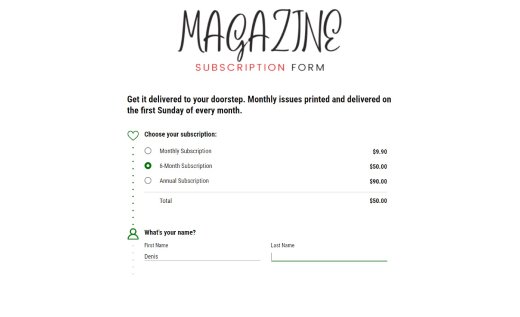
Forms with a flexible Stripe field that accepts one-time or recurring payments directly to your Stipe account. Charge a set fee, let buyers pay what they want, or link payments to selected products. Perfect for subscriptions, memberships, or online sales where you want secure checkout with Stripe. Read more about the Stripe field.
Multi-Option Checkout Forms (Forms with Order Carts, Calculations and Checkout)
Forms with a checkout page that brings everything together—Order Cart fields, extra price calculations, and a Checkout field that may be connected to your PayPal and Stripe account. Give your customers the freedom to pay the way they prefer: PayPal or Stripe, or no upfront payment. Read more about the Checkout field.
Simple Checkout
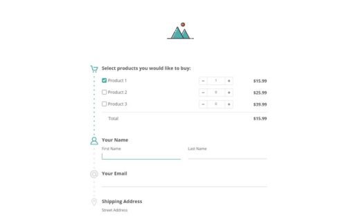
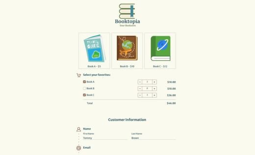
Forms with one or more Order Cart fields connected to the Checkout field. Perfect for straightforward online stores that want to offer payment options without extra calculations.
Advanced Checkout
Includes Order Carts plus additional Calculation fields to handle discounts, taxes, or custom pricing rules. Best for businesses that need automatic, accurate totals across complex orders before payment.
FAQs About Online Payment Forms
Are These Form Templates Secure?
Absolutely! You don’t need to worry about security with AidaForm. We never store or process any financial info — Stripe and PayPal handle all payments through their encrypted systems. On our end, we follow strict security standards, keep everything up to date and work hard to protect your data. Your personal and payment details are always safe with us.
Where Can I See Responses to My Form?
You’ll get an email alert every time a customer fills out your form, and you can send those notifications to multiple email addresses if needed. Want to do more? Send your payment details and form responses straight to Google Sheets or connect with other tools like Slack. You can also download everything to Excel to track payments, build reports or create a customer list.
Can I Customize the Payment Form Design?
Of course! Use the template as it is or fully personalize it. Change the design using themes or tweak the layout yourself. Add your logo, text, images, videos — even GIFs! Update product names and adjust colors and button shapes to match your brand. AidaForm makes it easy to build a payment form that looks great and fits your style.
How Can I Enhance My Form Sample with Extra Features?
You don’t need to be a developer to add powerful tools to your payment form sample. With an Expert account, you can unlock features like logic jumps that help users move through the form based on their answers — like skipping the address if they choose pickup.
Create a personalized thank you page that includes the customer’s name or tells them what to expect next. Want to offer a more chat-like experience? Try AidaForm’s conversational e-commerce features to keep things personal and help boost your online sales.
3 Simple Tricks to Improve Your Payment Forms
Keep your form design simple and on-brand.
Your payment form should feel like part of your business, so stick with the same colors, fonts and style your customers already know from your website. This helps build trust and recognition. At the same time, don’t overdo it — less really is more! A neat, streamlined form looks better and is easier to fill out. Skip any questions that aren’t essential and keep the focus on helping people pay quickly and easily.
Structure the form for a smooth experience.
People want to pay and move on — so help them do just that! Keep your form short and sweet. Break it into clear parts like contact details, items ordered and delivery options. That way, it feels more organized and less overwhelming. Use example text in fields to show what users should enter — little details like this can really make a difference. Avoid distractions and make every step clear, so customers can complete their payment without confusion.
Use simple, clear language.
When it comes to instructions, clear beats clever. Make sure your questions and labels are easy for anyone to understand — no jargon or vague phrases. Before you publish your form, ask a friend or teammate to test it and point out anything that’s confusing. Keep instructions brief and simple — no one wants to read a paragraph just to figure out what to do next. A clear form is a complete form!
